JESSICA FENDER
Art Director
About Vive Mejor: Vive Mejor is Unilever’s cross-brand digital platform, offering hispanic millennials practical and useful solutions to make life better. Solutions center on recipes and food-related ideas, beauty tips, and lifestyle areas of interest to Latinas, including millennials.
Brand Refresh
My roles
Art Direction, logo redesign, style-guide, visual design
Rationale
The overall style needed to be more simple and clean to fit in a more contemporary site that targets millennial women and men.
I kept the essence of the previous logo by maintaining the font lockup and the arched “VIVE” with the same modern typeface to preserve logo recognition.
I changed the “mejor” typeface to a timeless yet contemporary and editorial font that conveys elegance, high fashion and trust.
About
Vive Mejor started as a platform directed only to latinas, but In 2015, Unilever was looking to target hispanic male millennials to feature personal care brands such as Axe, Dove MEN and Degree. The previous logo was very feminine and didn't appeal to men and a redesign was needed to speak to the new audience.
New responsive site
The development agency provided the website framework and based on it my role was to define the visual design, create the design style guide and work with the developers on the on the styling implementation. The design elements also needed to be responsive.
Knorr Boullion animated banners
My roles
Visual Design, After Effects animation
Beauty and personal care social posts
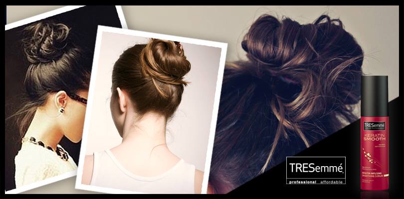
Messy bun ideas - TRESemmé Keratine Smooth
Hair accessories for summer - TRESemmé Keratine Smooth
Ruby red classic fall-winter look
Basics for a day to evening look
Red lip shades for different skin colors
Style collage for the PANTONE color of 2014 (vibrant orchid)
Food social posts
4th of July celebration - Popsicle
Words to live by - Lipton tea
Favorite flavor battle - Fruttare
Kale chips recipe
World cup cocktail DYI - Bertolli, Ragú and Popsicle


